Miruni
2022
Integrating two products into a seamless feedback experience that marking up the web
This project involved integrating two existing products, both of which had a browser extension and a web app. As Senior Visual & Product Designer, I led the design of the browser extension experience and built the product’s visual foundation for both the extension and the web app, while working closely with the Director of Product Design, a content designer, a UX researcher, and the three founders of Miruni.
Despite the project’s limited 7-week timeline due to fundraising goals, I prioritized tasks effectively and successfully launched the beta version in June 2023. Prior to this project, I also designed the brand identity and established a comprehensive design system aligned with the brand’s essence, contributing to the product’s foundation.
Skills
User Flow
Wireframes
Hi-Fi mockups
UI Design
Prototypes
Initial Design System
Visual Identity
Platform
Browser extension
Web app
My role
Senior Visual & Product Designer
Business Objective
Turning two pre-existing products into one seamless product to drive fundraising efforts and expand the customer base.
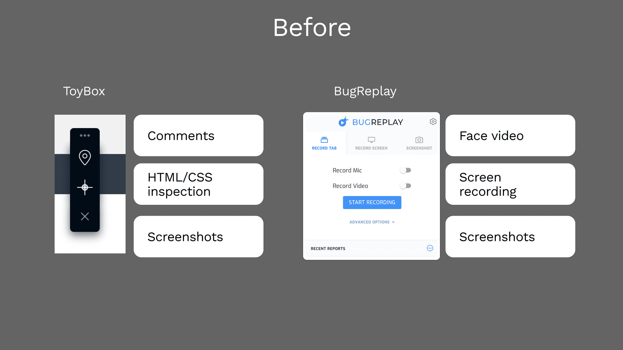
The capture of the pre existing products: ToyBox and BugReplay
ToyBox, a QA tool, acquired BugReplay which is a video bug reporting tool. ToyBox and BugReplay, both products consist of two parts; a browser extension where users can submit and find feedback visually, and a web app where they can manage all the feedback.
Miruni is the new brand and product name. Prior to this product design project, I built the brand identity alongside Creative Director.
Problems
What are the problems the existing customers and prospects facing?
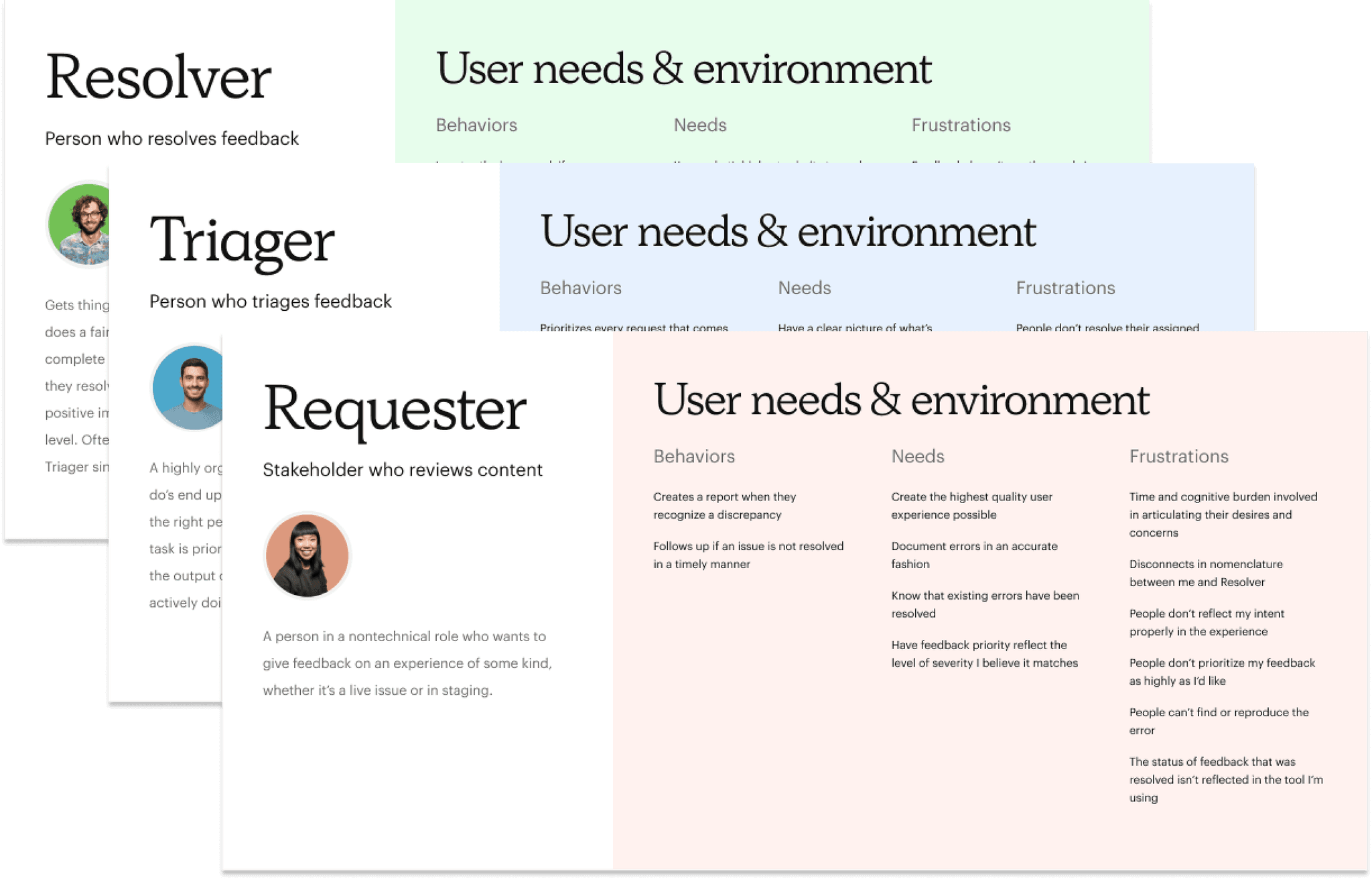
Customer type definition: Before I joined this project, Product Design Director and Content Designer had previously defined user types and problems based on user research.There are three types of Miruni personas.
Requester: Struggling to convey feedback.
Triager: Facing uncompleted tasks and shifting priorities.
Resolver: Facing with vague feedback and changing priorities.
Key Elements and New Opportunities
Distilled the core experience and new opportunities that existing customers wanted.
I also referenced the card sorting our UX research conducted. This gathered insights from existing users that what experience they most loved and what they hoped to have. Since the existing products had already tried to solve the user problems, I wanted to make sure what we needed to keep and add for the better experience.
Here are the highlighted key elements and new opportunities I found.
Solutions
Final Design
Miruni Prototype I made: Imagine you're working on a website called "mmhmm" and leave and manage feedback on the website.
Explorations
How I landed on the final design?
↓
Explored Area #1 Base Layer
Improved Base Layer to meet all user types needs without extra tap and allow them to submit feedback report from a mobile web view.
The first thing I addressed was "Base Layer" which is an essential part of the browser extension that users will see first when they open the extension.
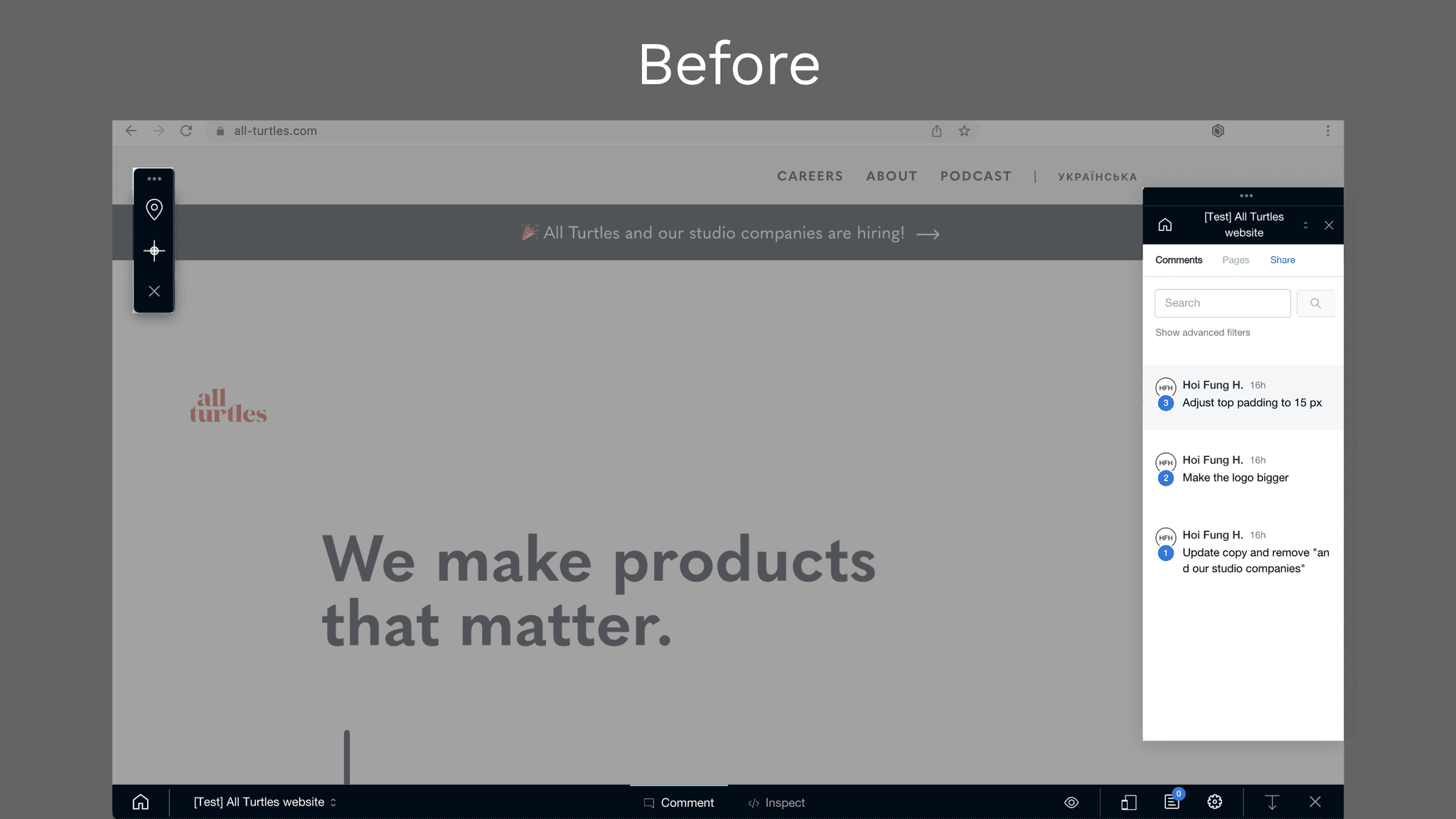
The pre-existing product’s browser extension. It’s consist of three panels – it’s hard to navigate people. Especially for commenting, there are three parts are related to that. Where I should click first? Which icon I can see the comment?
Option 1: One panel
The idea I came up with first was one panel direction. Users can find the extension panel easily, the main features are aligned so it easily navigates them.
One panel option
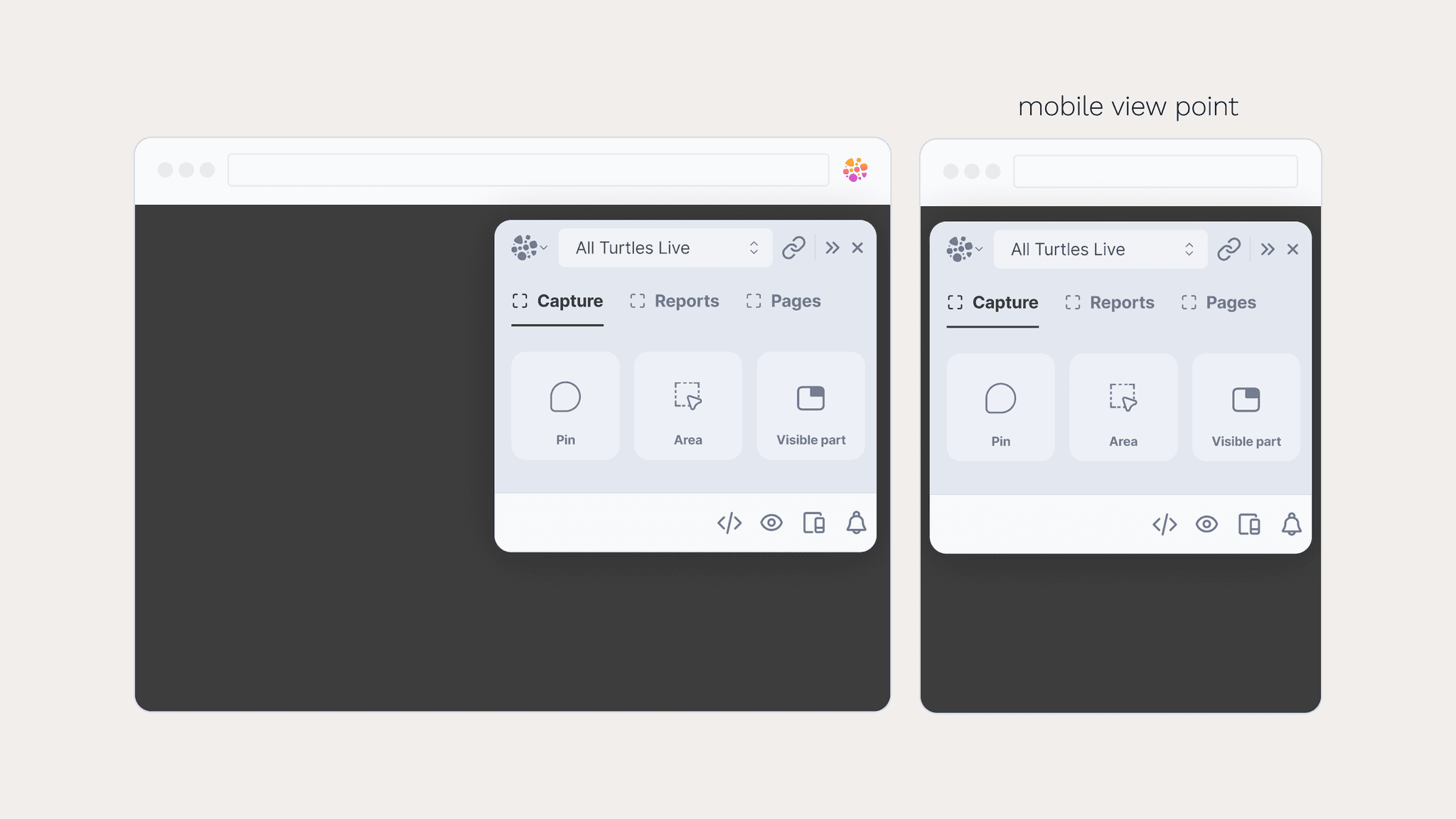
Option 2: Two panels
Then, I came up with alternative solution; two panels. This enables all types of users access their needs without extra tap. And it fits in even the small viewpoint.
Two panels option
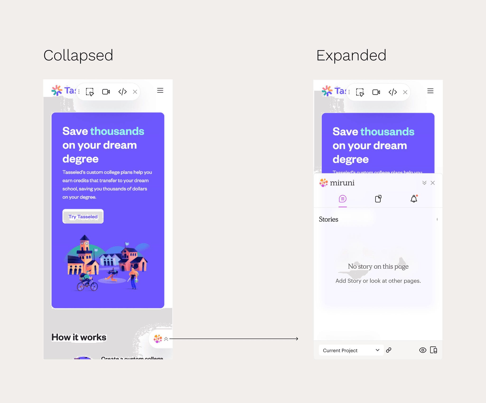
A mobile view looks like in hi-fi design
Explored Area #2 Capture Feedback
Elevating the existing capture feedback experience, not just merging two products.
The next thing I addressed is a capture feedback flow, like how you leave feedback. Given the need to merge two products, there were a lot of ways to capture feedback. For ToyBox, you can leave comments with screenshots, and inspecting HTML/CSS elements, while BugReplay, you can record screen and your face video.
How could we optimize the capture feedback flow?
I started thinking from words – I came up with two design directions: one starts with selecting the capture method then selecting the capture area, while the other follows the opposite flow.
After discussing this with the content designer and the founders, my decision was the capture method oriented, because it’s intuitive and easy to understand how Miruni works and what it generates.
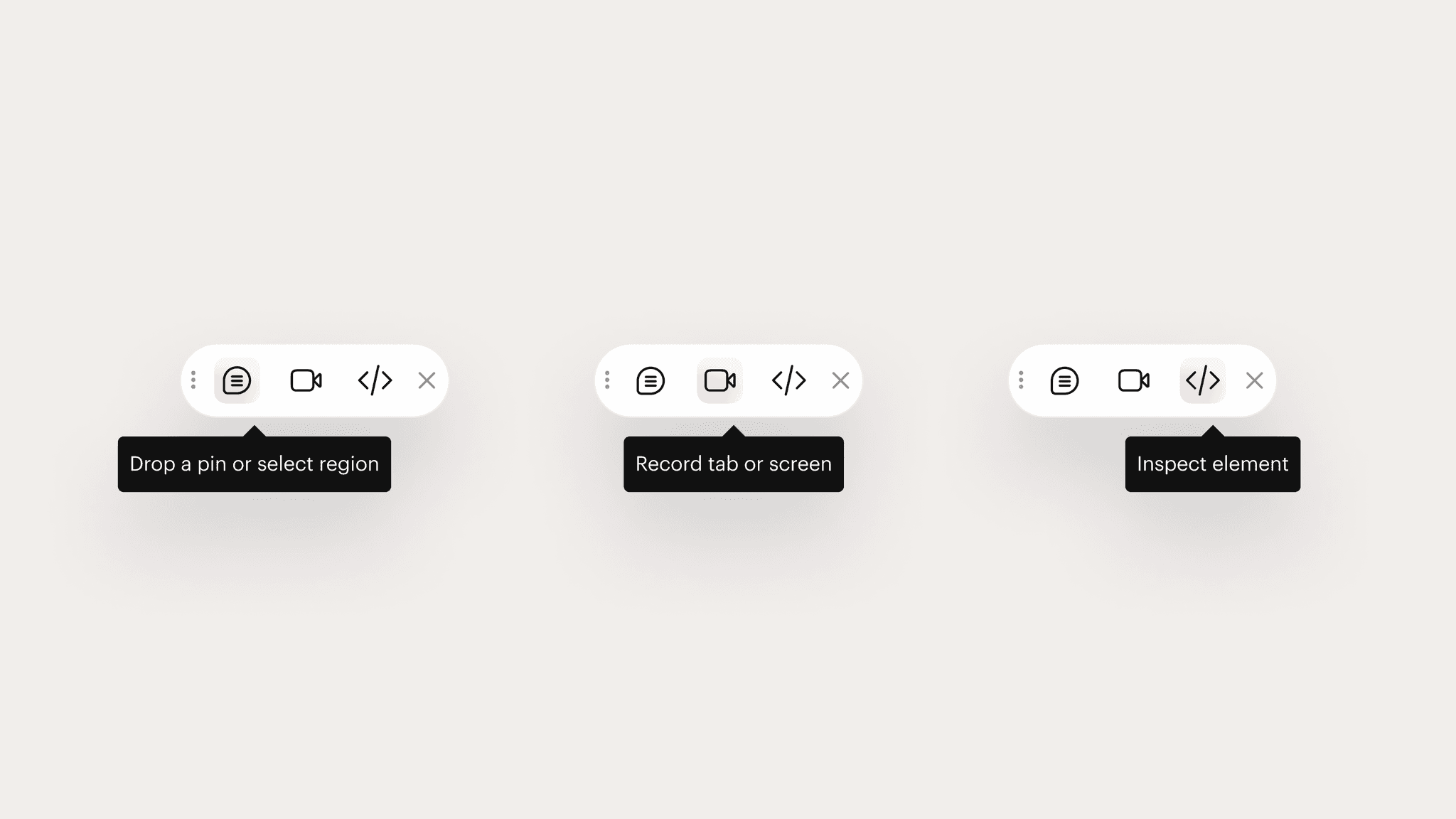
UI for the capture method oriented
The icons represent outcome; comments, video, or inspection and after hovering them, the tooltip shows what action users need to take.
No matter which method you choose, you will eventually leave a comment. The comment box UI varies depending on the selected method, but the text field has been designed as a consistent component.
The variations of the comment box UI.
I made only the required elements visible, allowing optional elements to expand as needed. Additionally, based on user feedback, you can now include related URLs and attach related files.
The common part of the comment UI.
Explored Area #3 Feedback Detail
Set priority levels, categorize feedback, assign a team member, and add comments to clarify next steps.
This is the previous design of Toybox's feedback view. It’s a simple comment view, but there were issues that made it challenging for users to complete their tasks. The icons were not clear in indicating their functions, and the current status of the task was not evident.
This is new Miruni’s detail view. To streamline the user experience and make it easier for users to take action, I divided the content based on the user type and their specific needs.
Feedback detail view: This is the new Miruni’s feedback detail view I designed.
The left side is for everyone, it shows the essential information of the feedback.
The right side bar is for Triagers where they can move things forward like assigning someone and changing a priority, etc.
The Details tab is for Resolvers. Engineers can see user environment of the report sender such as OS and Browser info.
Handoff
Detailed design spec
I handed off the user flow and design spec. I also created design system in Figma so that a designer and an engineer on the Miruni team could continue working on.
Handoff file
Initial Design System
Conclusion
Created a seamless feedback experience and influenced other designers and provided an efficient workflow.
Rather than simply merging two products, I incorporated user needs to build a more seamless feedback experience. I also designed a few more features/flows, and the foundational UI design for the web app.
I can see how my initial design has influenced their product as it stands today. With my design guidelines, other designers were able to work independently and move the project forward.
Led to the beta launch.
I also designed the landing page. We launched the wait list. I also made a communication plan and emails for existing customers to allow them to transition to the new product. We launched Miruni Beta in 2023.
The project scope was focused on fundraising, and I didn't have the opportunity to conduct usability testing within the timeline – we had only 7 weeks.
If I remained on the project...
Building out the full web application
Conducting QA with engineers
Conducting usability testing and iteration


