
Finery is an online service that curates a digital wardrobe by organizing and coordinating users' clothing from their purchase history. With the challenge of a cluttered dashboard leading to decreased user engagement, I provided art direction and ux design, collaborating with a team of five designers. Together, we centralized the calendar and made pivotal visual decisions, enhancing the platform's usability and ensuring a cohesive vision throughout the project.
Year
2018
Timeline
3 weeks
My Role
• Art Director • Product Designer
My Deliverables
• Low fidelity prototype • High fidelity prototype • Design guidelines
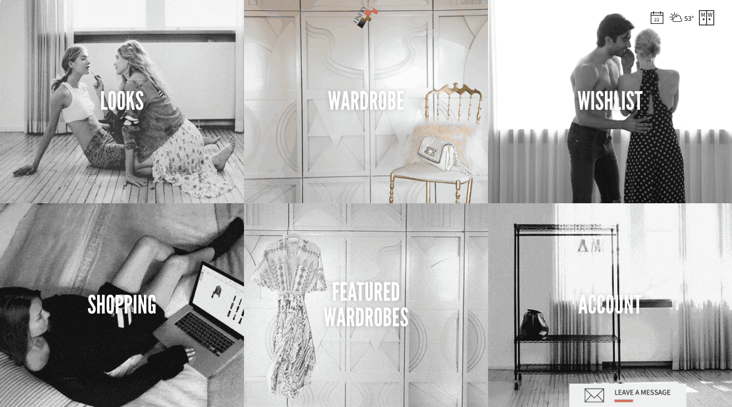
Problem
The image above is Finery’s dashboard prior to renewal. The main user experience was difficult to understand because there was a menu consisting of 6 options on the main screen of the dashboard. As a result, there was a decline in user actions, so increasing user engagement was a problem. Therefore, it was necessary to design the functional dashboard in a way that would increase the usage frequency of the coordination feature to keep users interested.
Solution
At the inception of the redesign, there was an inclination to incorporate various features, such as the Returned Goods Alert, Sales Alert, and Referral Introduction, into the new dashboard. However, iterative sketching revealed that while these features were pivotal from a business perspective, they didn't necessarily align with the primary user experience centered around shopping.
Recognizing the essence of Finery's service – aiding users in managing their personal wardrobe and inspiring daily clothing coordination – the solution became evident: streamline the dashboard to focus primarily on the calendar function.


Calendar view
Positioned as the centerpiece of the dashboard, the calendar function offers versatility. It was paramount to ensure that these views were responsive, allowing a seamless experience across various devices.
Week View: Incorporating user feedback, the default display is set to a week view, with "Today" positioned on the far left for easy week-long visualization.
Month View: The month view is designed for forward planners, offering a comprehensive coordination list on desktops. On mobile, it simplifies to only marked dates for quick outfit checks.
Day View: This view presents a detailed coordination photo alongside the day's schedule, providing users a complete look at their day.
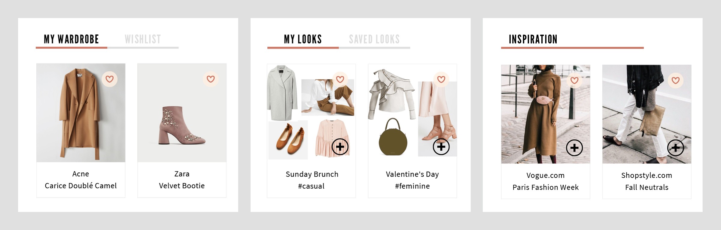

Item feed
Finery's design was evolving, with various coordination items available for the calendar, such as Your Clothing, Your Wishlist, Coordination collages from EC sites, Collages by other users, and Celebrity snapshots. I streamlined these into three categories: My Wardrobe, My Looks, and Inspiration, with specific items organized under respective tabs. Users can easily pick from these categories to populate their calendars.
Multiple Select
Users have the ability to choose multiple items for their calendar and 'My Looks'. The primary design intent was to enhance ease of item addition, promoting more frequent outfit coordination.
Visual design refinement
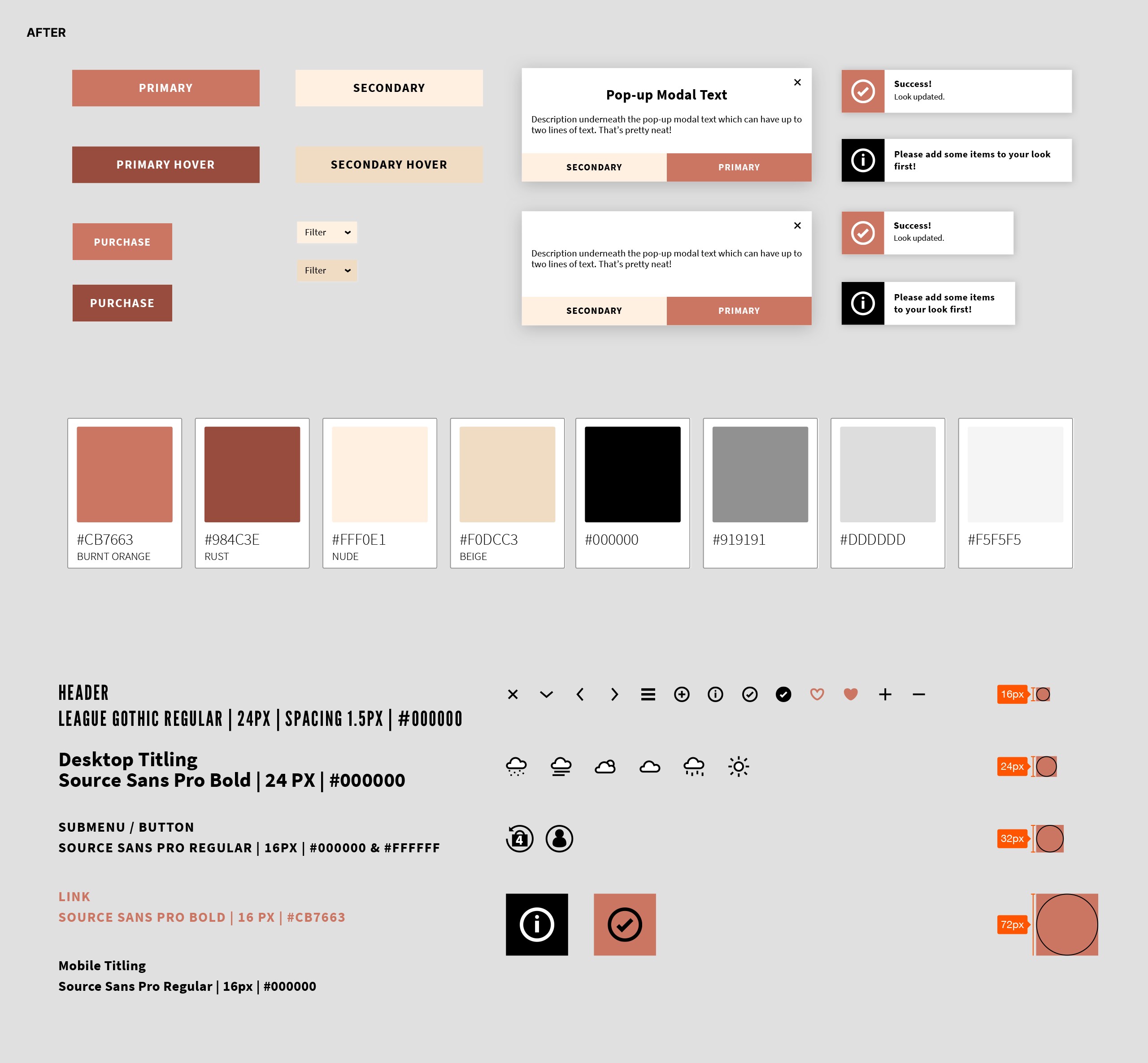
There was user confusion due to identical colors representing both Yes/No options. Moreover, the prevalent blue and green hues in the palette diverged from Finery's chic image. I revised the components and buttons, opting for a more concise color range: neutral, black, and Finery's signature orange. Concurrently, I ensured uniformity in icon sizes and styles.
Before progressing to the mockup stage, inconsistencies in button designs and spacings became evident. To rectify this, I instituted precise design principles and developed an exhaustive set of guidelines for the website's visual framework.

Wrap up
I not only changed the layout of the dashboard, but I also redesigned the website by making the calendar the starting point of the user experience because the original website was confusing for users. In addition, as a personal challenge, I was responsible for making all the decisions on the visual side.
